Get Your APEX Region CSS Layout on Point

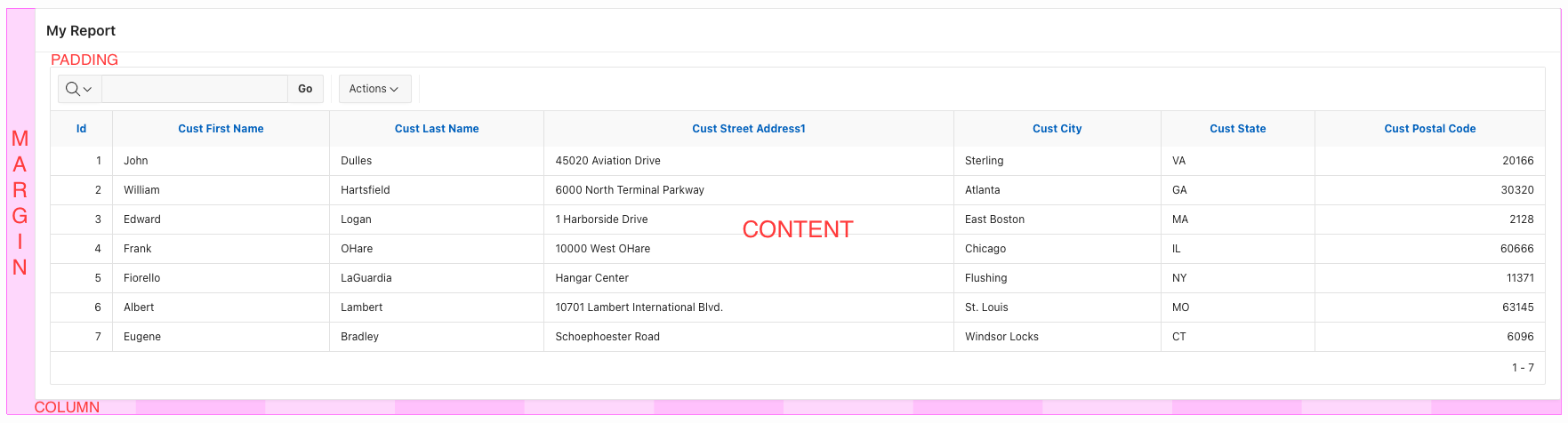
To comprehend the APEX Region responsive design, it is essential to comprehend how the CSS box model functions. The CSS box model is a box that wraps around each HTML element and is composed of four elements: the content itself, the padding, the borders, and the margins.

Content - The content of the box, where text and/or images appear
Padding - The area around the content. The padding is transparent
Border - A border that goes around the padding and content
Margin - The area outside the border. The margin is transparent
As demonstrated in the example below, the CSS box model can be applied effectively to APEX regions. The CSS box model outlines the space that an element (in this case, the region) occupies, and is composed of four distinct components: the content, padding, border, and margin. The content is the space taken up by the region's content, such as text or images; the padding is the space between the content and the border; the border is the outermost edge of the region; and the margin is the space between the border and any other elements in the page.
We are fortunate that APEX provides us with declarative methods to adjust the margins and remove the padding on the Template Options when we edit a region. APEX pages use a responsive 12-column grid view and we can also manage the region content position in a declarative way. On the region layout, we can set the column and column span to alter the position of the region inside the region container. The example below demonstrates how we can centre a report region. By setting the Column to 2 and the Column Span to 10, the region's position is changed so that it begins at the second column and fills the space of 10 columns.

It is possible to manage the positioning of items within a region, which is a great way to create an aesthetically pleasing and well-organized region. This can be achieved in a few different ways, such as rearranging items to fit better in the region, adding items to fill in gaps, or removing items to reduce clutter. This allows the user to customize the region to their liking, as well as ensure that the items within the region are arranged in a functional manner.

Item 1: The default item settings when the label template is Option or Required. The label container uses 2 columns
Item 2. The Label Column Span is set two 1. The label container only uses 1 column
Item 3: The Label Column Span is set to 0 the label template is hidden. Note that in the 4th column there is a pink border. That is because I set the column span to 4, meaning the label and the item need to fit inside the 4 columns.
Item 4: Uses the label template Option - Above.
Note that the Label Column Span manages the width of the item/label container not the width of the item. To set the item width edit the item and change the Width value under Appearance. By default, this value is 30. It is also important to not exceed 12 columns. By default a row only fits 4 items using an Optional/Required template because the label uses 2 columns and the item 1 column for a total of 12 columns. If we add another item we will see an error message like Label of Page Item P1_NEW cannot be rendered as the label column span grid setting for this page item is invalid. It is set to be displayed with a Label Column Span of 2. This is not supported as the page item itself only has 2 Columns available.